RV Park Website Design: The Essentials That Win Bookings
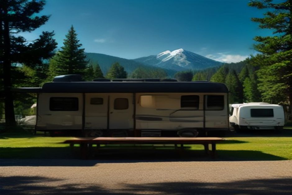
Your website is the first campsite a traveler ever visits. Long before anyone pulls in past the office, they judge your park by the pictures, the load time, and how quickly they can see whether you have a spot for the weekend. Good RV park website design is not about looking fancy — it is about removing every reason a ready-to-book camper might click away. Get the fundamentals right and the site quietly fills sites for you, night after night, while you are out running the park.
Design for the Phone First
Most people planning a trip are doing it from a phone, often from the passenger seat while the miles roll by. If your site is hard to read or tap on a small screen, you lose them before they ever see your rates. Mobile-first design means the layout, buttons, and booking flow are built for a thumb and a 5-inch screen first, then scaled up for desktop — not the other way around.
In practice that means large, legible text, generous tap targets, and a single clear path down the page. Skip tiny menus, hover-only effects, and dense columns that force pinch-and-zoom. When a traveler can read your park name, see a photo, and find the "Book Now" button without a single frustrated tap, you have already beaten most of the competition down the road.
Speed Is a Feature
Every extra second a page takes to load costs you visitors. Campers on cellular data at a rest stop will not wait through a slow, heavy homepage. Fast campground websites keep image files sized correctly, avoid bloated plugins and auto-playing video, and load the important content first. A site that appears in a second or two feels professional and trustworthy; one that hangs feels abandoned, no matter how nice it looks once it finally arrives.
Speed also feeds your rankings. Search engines favor fast, stable pages, so a lean site helps both the guest and your campground SEO at the same time. It is one of the rare places in campground management where the cheap, technical fix and the guest-experience win point in exactly the same direction.
Show the Park With Real Photos
Nothing sells an outdoor stay like seeing it. Real, current photos of your sites, the pull-throughs, the bathhouse, the lake at sunset, and families around a fire do more work than any paragraph of copy. Generic stock images of some other forest actually hurt you: seasoned RVers spot them instantly and start to wonder what you are hiding.
- Show the actual sites. Big-rig owners want to see the length, the levelness, and the trees before they trust you with a 40-footer.
- Feature the amenities. Clean restrooms, a pool, laundry, a dog run, full hookups — photograph what makes people choose you.
- Set the mood. A few lifestyle shots of the experience help travelers picture their own trip and book on emotion.
Make the Structure Obvious
A visitor should never have to guess where to go next. The best RV park website design uses a simple, predictable structure: a homepage that states who you are and where, then clear pages for sites and rates, amenities, things to do nearby, park rules, and contact. Each page answers one honest question a traveler is already asking.
Keep the Menu Short
A short, plain-language menu beats a clever one every time. Five or six items covering the essentials is plenty. Bury nothing important two levels deep, and put your address, phone number, and a booking link somewhere on every single page so a guest is never more than one tap from reserving or reaching you.
One Clear Call to Action
Decide the single most valuable thing a visitor can do — almost always, book a stay — and make that action impossible to miss. A bright, consistent "Book Now" button in the header and repeated down the page gives the traveler an obvious next step at the exact moment they decide. When the booking engine lives right inside your own site instead of bouncing guests to a generic third-party page, trust stays high and far fewer people abandon the process halfway through.
Build Trust in the First Screen
Travelers are handing you a deposit and a night of their trip, often sight unseen. A few honest trust signals close that gap fast: guest reviews and ratings, a real physical address and map, clear cancellation and pet policies, and a phone number answered by a human. Design these into the page rather than tucking them away. A site that looks cared for tells campers the park is cared for too.
Design and SEO Work Together
A beautiful site nobody can find is a billboard in the desert. Thoughtful design and local search go hand in hand: descriptive page titles, a page that names your town and region, fast mobile pages, and real content give search engines something to rank. Strong campground SEO brings the traveler to the door; strong design walks them to the booking button. Treated as one system, they turn casual searches into confirmed reservations — which is the whole point of doing this well in the outdoor hospitality business.
Start Where It Counts
You do not have to rebuild everything at once. Pull up your own site on your phone tonight and try to book a weekend. Time it. Notice every place you hesitate, squint, or scroll to find something obvious. Those friction points are your priority list. Fix the phone experience, speed up the pages, swap in real photos, and make the booking button unmissable — and you will feel the difference in your occupancy long before the season peaks.